Taking the "Drag" Out of Drag-and-Drop
Today we're releasing a collection of updates to significantly improve the drag-and-drop experience in Divshot. Check out the rundown below to learn about what's new!
Smart Cursor Placement
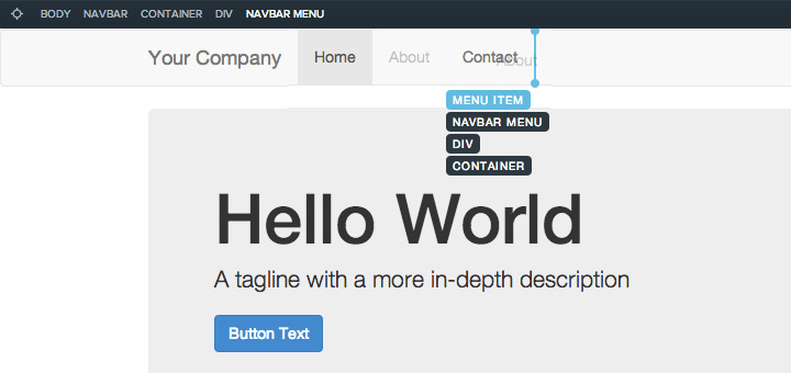
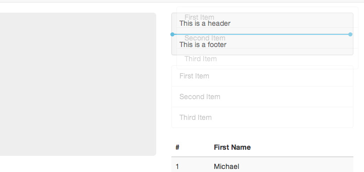
To eliminate flickering we switched from ghost placement to cursor placement. You'll notice a blue line indicating where your component will drop in the canvas. This blue line will be shown horizontally or vertically depending on the target:
While dragging around, the breadcrumbs will change to show you the current drop target. Releasing the mouse will return the breadcrumbs back to your original selection:

We took great care in making sure the cursor placement performs exactly how you'd expect. For example, columns inside rows can be different heights. One column might be taller than the other. Say you had two columns like so:
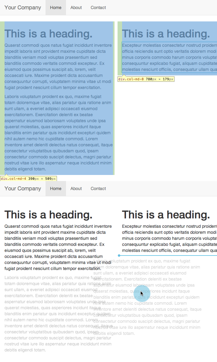
When your mouse cursor is over on the right, we wanted to make sure the drop target would be the right column and not the row or container. Focusing on these types of scenarios has made the dragging experience much more robust and easy to use. You no longer have to worry about placing your cursor at a precise spot. To achieve this we analyze all of the surrounding elements around a potential target and added several new measures to compare each component.
Don't worry, ghosting hasn't gone away completely. You can always toggle the ghost rather than the cursor by holding down the Ctrl key and moving your mouse around the canvas.
Container Stacks
Sometimes drop targets are difficult to select because multiple targets can share the same offsets from the top of the page. There's no padding between these targets where you can select the one you actually want. Here's an example:
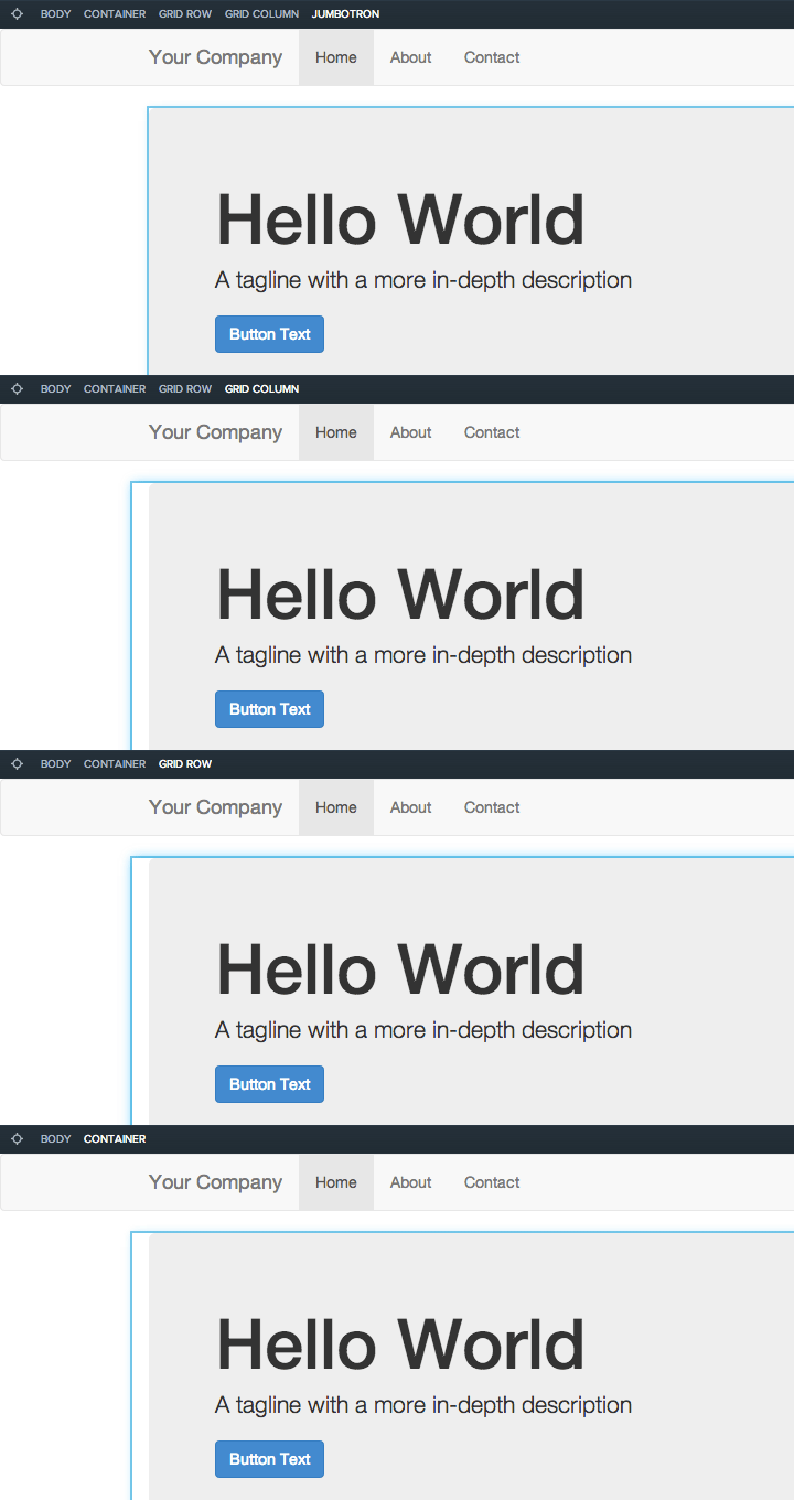
Notice how the container, row, column and jumbotron are exactly the same distance from the top of the page. If I move my mouse cursor near the top of the jumbotron it's going to select the jumbotron. What if I wanted to drop my component into the column above the jumbotron instead?
Enter container stacks. When you move your mouse cursor near an edge with multiple targets sharing the same edge, a container stack will appear. Hold down the Shift key to lock the cursor in place and then hover over one of the container labels:
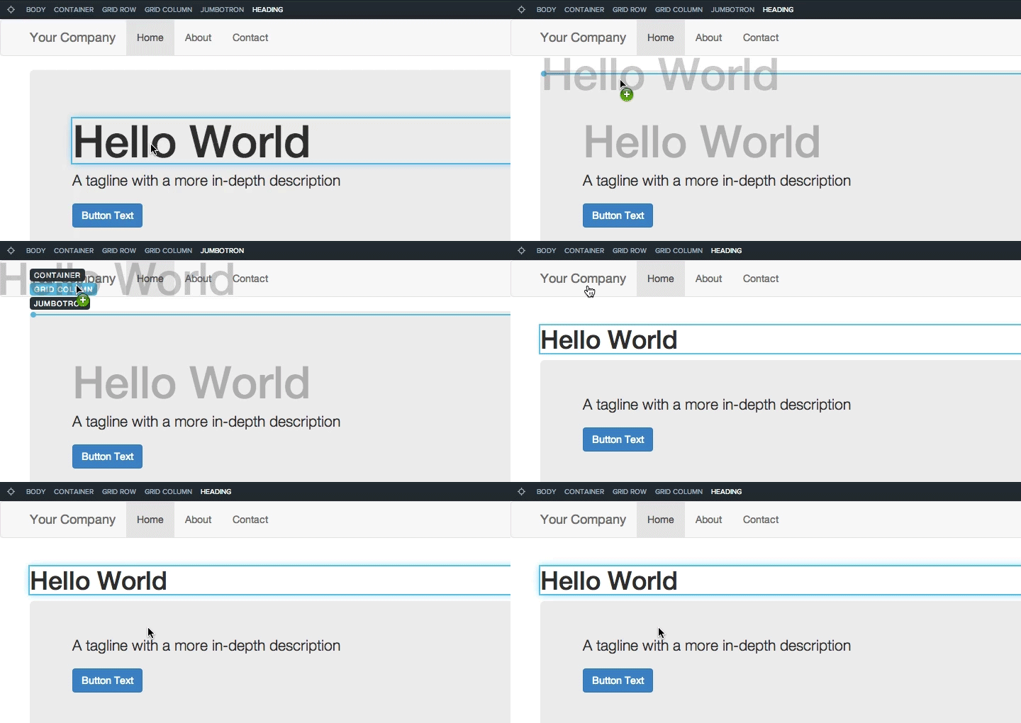
Target acquired. Moving things around is easier than ever.
Pinpoint Targets
To speed up component selection so you don't have to click around as often, we added the ability to highlight components via mouse hover. Click the pinpoint button near the breadcrumbs or hold down the Alt key while hovering over components to select the component you actually want to select:
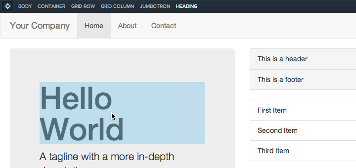
This is useful when you're working in complex layouts with nested components such as forms. With so many things to click on it's better to get it right the first time.
Component Quick Add
Sometimes it would be nice not to drag anything at all. Many of you have requested a way to drop subcomponents such as menu items via the right-click menu. Now you can:
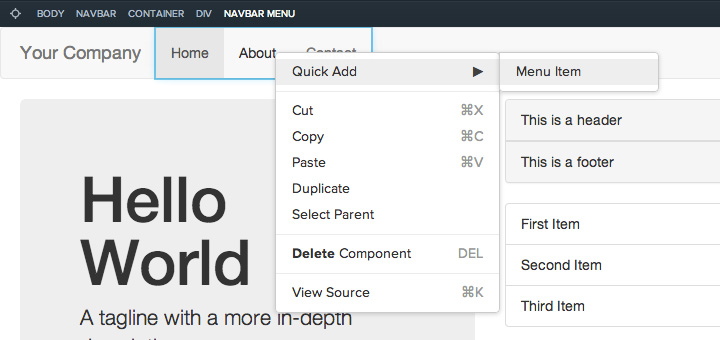
The Quick Add option should be available for components with subcomponents such as Form and Menu.
Rapid Parent Selection
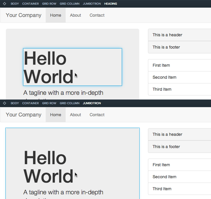
Selecting parents of a component should be a piece of cake. Previously you'd have to select the parent from the breadcrumbs. After we left beta, you could use the H / J / K / L hotkeys to move around components in the canvas. The H key has been a huge timesaver for selecting parents. We added a way to select parents from the mouse as well. Hold down the SHIFT key while selecting a component. You'll select the parent component instead:
Wrapping Up
Drag-and-drop is at the heart of Divshot and we're relentlessly improving it. We want to make sure your experience building new pages is phenomenal. If there's anything we can do to make it better, reach out and let us know!
 Divshot has joined Firebase!
