 Divshot has joined Firebase!
Exploring Google's Material Design with Polymer
Today Google announced material design, a new design language for Android, Chrome OS, and web apps. Material design unifies visual, motion, and interaction design across different types of devices. It's modeled after tactile materials like paper and ink with fluid animation and lighting. Polymer brings these paper elements to life on the web. In this article we'll explore Polymer's material-themed components and learn how to quickly build apps using this new design paradigm.
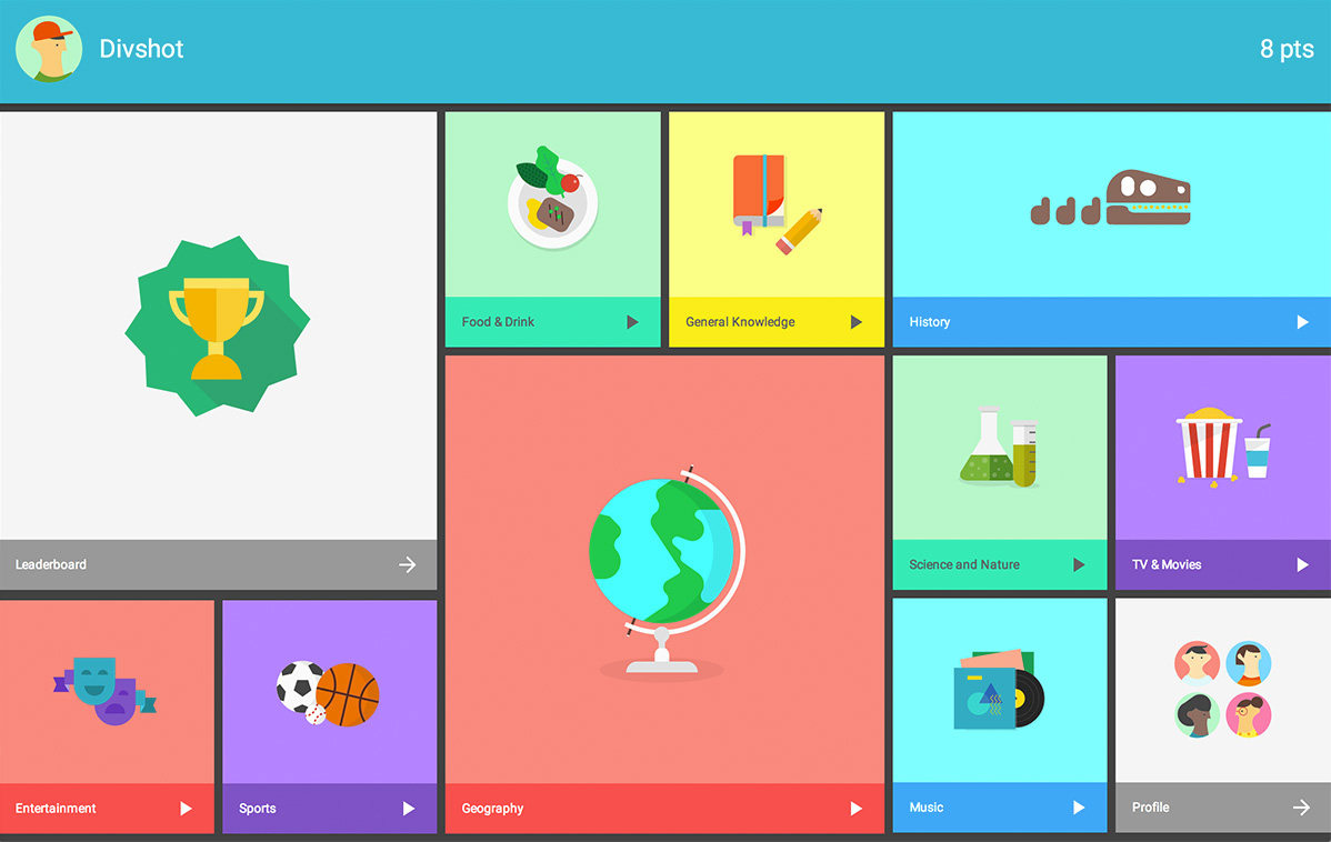
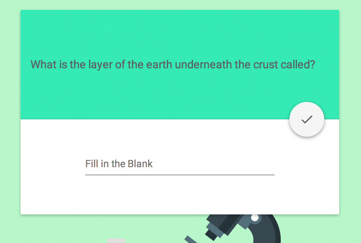
Polymer and material design in action with Topeka, a potpourri trivia app.
Getting Started
Not familiar with Polymer? The Getting Started guide comes bundled with a starter project and short tutorial to get you acquainted. After that it's easy to install paper elements. Do one of the following:
- Download the zip
- Bower:
bower install Polymer/paper-elements - Git:
git clone https://github.com/Polymer/paper-elements.git components/paper-elements
Once components/paper-elements is in your project root, import the definition:
<link rel="import" href="components/paper-elements/paper-elements.html">
Material Components
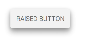
Similar to front-end frameworks like Bootstrap or Foundation, Polymer's paper elements include form controls, dialogs, and tabs. Thanks to Polymer's declarative nature they're very simple to use:
<paper-button label="flat button"></paper-button>
<paper-button label="raised button" raisedButton></paper-button>
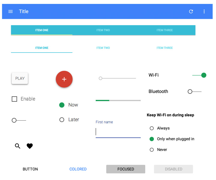
Here's a list of the standard UI components available in paper elements:
- paper-button
- paper-checkbox
- paper-dialog
- paper-input
- paper-item
- paper-progress
- paper-radio-button
- paper-radio-group
- paper-slider
- paper-tab
- paper-tabs
- paper-toggle-button
And this is what you can expect to see after adding them to your app:
However, there's much more to paper elements than that.
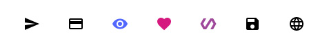
Icons are another important aspect of material design. You'll use them everywhere. Polymer provides over 150 common icons out of the box with <core-icon>:
<link rel="import" href="components/core-icons/core-icons.html">
<core-icon icon="info"></core-icon>
Besides the typical UI components you'll find in other frameworks, there's several that appear uniquely Google such as <paper-toast> (notification popup), <paper-menu-button> (menu dropdown) and <paper-fab> (floating action button):
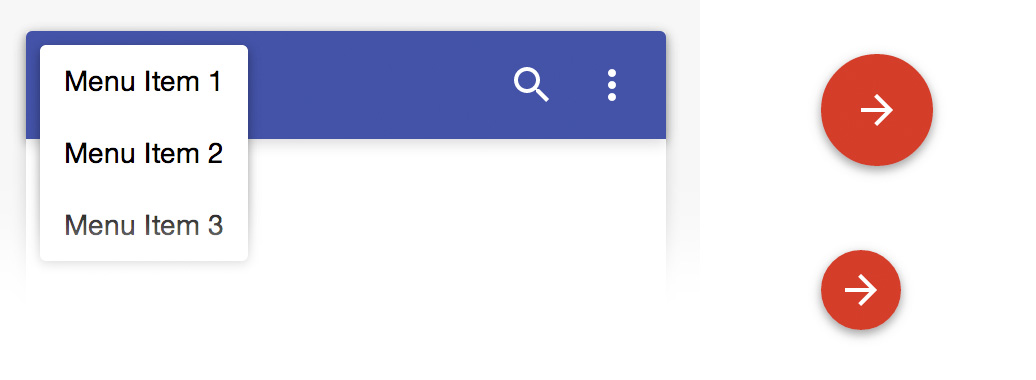
The floating action button is perfect for call-outs and directing the user to the next step in your app:
For a full preview of paper elements, view the demos here. To get in-depth implementations for specific elements, check out the docs.
Material Effects
To convey relationships between different areas of our web app and go beyond the inherent flatness of paper UI we need to take advantage of shadows, elevation, and other effects. In Polymer, this is done by nesting paper effect elements inside containers such as a <div>:
<div style="width: 100px; height: 100px;">
  <paper-shadow z="3"></paper-shadow>
 </div>
The <paper-ripple> and <paper-shadow> effect elements can be used for your own components as well as generic HTML elements. Ripples provide a form of pleasant feedback and indicate to the user where they interacted with an element. Shadows provide context and help certain areas stand out above others.
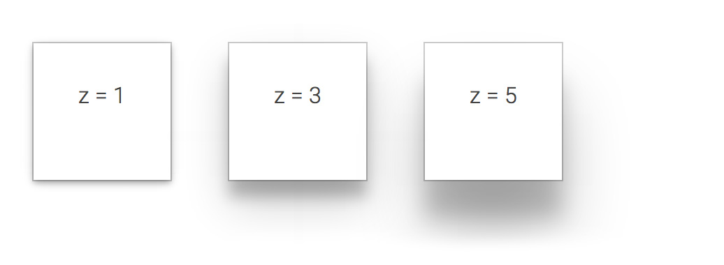
When combined with touch-based actions, animated shadows can offer visual feedback similar to a ripple. Many paper elements have shadow effects built in, such as <paper-button>. When using the raisedButton attribute, the shadow intensifies when the button is touched.
Transitions
Animation in web apps can make a significant improvement to your overall user experience. Transitions provide a seamless way of directing a user from one page to the next. In paper elements, there's a variety of elements to handle transitions for dialogs and menu buttons. Polymer's core element <core-animated-pages> handles transitions between pages. The core-animated-pages demos and Topeka sample app provide some great examples.
For material design, hero transitions are a common way to transition between pages or views. When an element is selected, the starting page morphs into an element on the ending page. It's a beautiful, engaging way to direct users from one thing to the next. Cross-fades can also be used for a less dramatic transition.
It's really exciting to see Google leverage Polymer and Web Components for their new unified user interface. With Polymer's declarative syntax, it's so much faster to build web apps and integrate powerful UI components. We'll continue to discuss material design as more concepts are fleshed out. In the meantime, I suggest you start hacking away with Polymer. It could be the next big thing.
Stay tuned for more articles on everything Polymer this week from Divshot!